Eyeflow Internet Marketing
Quest Healthcare Development – A Case Study

The Problem
During my time at Quest Healthcare Development, I worked closely with the sales and marketing teams for each company, and even spent a few months on the road doing sales calls for one of their subsidiary companies. The biggest problem we faced at the time was communicating the structure and inner workings of Quest Healthcare as a whole to new/potential clients. Because of the confusion and lack of a central vision, each company had their own way of addressing the issue. Some chose to function independently from Quest (Allstar Therapies & Express Mobile Diagnostics), while others made it a central part of their marketing strategy (Loyalhanna & William Penn Care Centers). There were 11 companies in total, and all but 4 were essentially hiding the fact that they were a part of something greater. This was the one thing that truly set us apart from our main competitors, which were independently-owned small businesses.
We were in dire need of something that could break down what Quest Healthcare was, and what we did. After much deliberation between the companies, that ‘something’ ultimately ended up being a printed marketing piece that we could present to potential clients. Each company already had their own bulk of material that focused on their individual services, so it needed to be short and to the point.
How could we explain the somewhat convoluted structure of Quest Healthcare in a way that anyone, even nursing home residents, could understand?
The Users
For people that have been in the geriatric healthcare industry for most of their career, the idea of a parent company is fairly common. It’s typical for a company to own multiple skilled nursing, personal care, and independent living homes. However, it is not typical for those companies to also own physical therapy, mobile diagnostic, or back-office support companies. Most NHA’s (Nursing Home Administrators) could follow the conversation, but at a certain point things would get messy and confusing.
That being said, NHA’s were the easiest target to address with this piece. The owners of Quest also wanted this piece distributed to care home residents, which is where the challenge really came into play. The accessibility needed to be balanced between experienced professionals and families that were new to geriatric healthcare.
The Methodology
The general flow of the print piece was established early on: introduce the reader to Quest as a whole, and then go into further detail about each specific company and their services. This had been attempted in the past by different companies, but usually involved a Powerpoint presentation or packet that was too long to hold anyone’s interest.
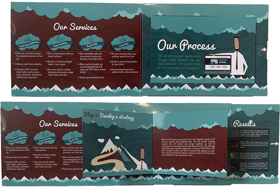
There was a print piece I had received from a company called Eyeflow Internet Marketing that helped inspire the general flow of the Quest piece. It was essentially a “brochure inside of a brochure”. Not only was it compact, but it held a tremendous amount of information; in a way that was engaging for the reader.

The idea was to create a simple Quest brochure that could expand further to reveal information about the subsidiary companies. Budget constraints made something like the Eyeflow brochure impossible, so I set out to find a folded brochure style that was more affordable. That led me to the double gate fold – a simple bi-fold brochure for Quest that would expand further once the reader had educated themselves on the parent company.
The layout also allowed room for some bonus material, such as showing off the signature “Quest Building” that was known around the area because of its location and vibrant appearance. I had talked to many people in the area that knew of the building, but had no idea what it was for. Even the residents living at the nursing home next door had no idea it was affiliated with the place they were staying.

The final hurdle of the project was creating the content. There was no Quest-specific marketing material at the time, aside from a paragraph written by the owner. After adding some fluff to it, the text only took up about half of a page. I ended up adding a national map to show the 13 state we operated in, as well as a timeline of when each subsidiary was created. The end result was a comprehensive and simple look at Quest Healthcare that showed off our goals, size, and experience.
Each subsidiary company was asked to submit a character-limited entry to explain their services, allowing them to fit into fully expanded interior page. The character limit was determined by the size of the company and its importance to Quest as a whole.
The Outcome
This project was the start of a long, and ultimately successful, rebranding of the company. It was the first piece of marketing material centered around Quest Healthcare Development as a whole, and continues to be one of the most widely distributed handouts.
The versatility of the brochure allows it to be used for just about anything, from sales calls to fundraising events. The flow allows readers to digest information at an appropriate pace, and most importantly, the owner of Quest Healthcare was very happy with the final product.

Final Quest Healthcare Development Brochure
