The Project

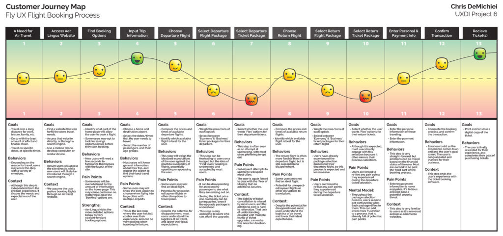
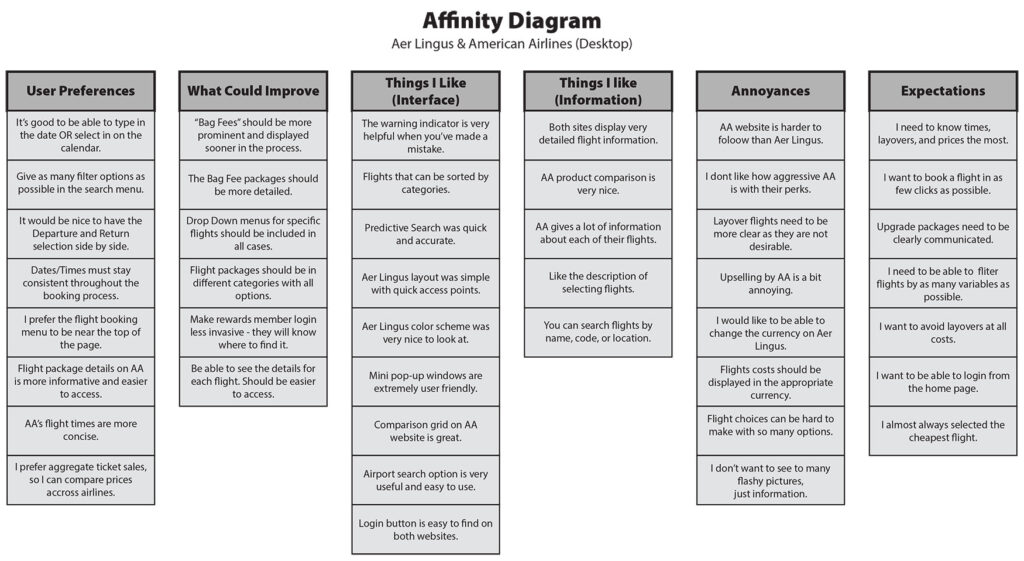
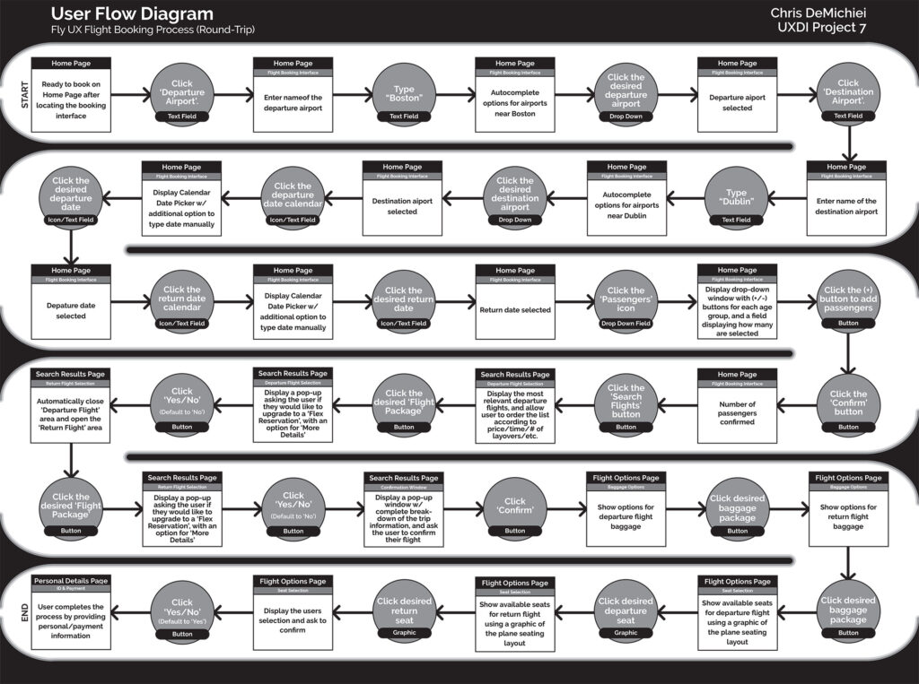
This project was the main focus of a 6-month UX Design course with the UX Design Institute. I was tasked with conducting research into the flight booking process, analyzing the research, and ultimately fleshing out a flight booking interface for a desktop website.

Throughout the project, I learned some of the foundations of UX Design, and was able to apply my knowledge of graphic design in a new way. The final product was a medium-fidelity prototype and a wireframe breakdown of the flight booking process.

The Research

Because I was starting this interface from scratch, the first step was to look at the competition. What made other flight booking interfaces easy to use, and what was causing pain points?

I began by conducting usability tests on established travel websites, taking notes, and building user personas. After seeing how average users interacted with the flight booking interface, I was able to create an empathy map and affinity diagram to target the pro/cons of the typical user flow.

The Process

With a solid understanding of what the typical user was looking for in a flight booking interface, I began to plan the general user flow of the new interface. The user flow diagram that resulted allowed me to look at the process from an objective point of view and iron out the general flow without having to worry about the appearance of the interface.

Once the user flow was established, I was able to start building a rough sketch of the interface. This would serve as the foundation for the first low-fidelity prototype before fleshing out the aesthetic design.

The Results

Typically, the next step would have been to develop a medium-fidelity prototype to conduct further usability testing, but I was able to move on to a high-fidelity prototype and wireframe after receiving feedback from my instructors.

I made some minor adjustments to the rough screen-state sketches and began to develop finalized mock ups of each step in the flight booking process. Each page had its own interface, and dozens of screen states to show a developer exactly how the website needed to behave and when. This was done using Adobe XD.

The Adobe XD file was imported to InVision to create a working prototype for further user testing, and the screen states were broken down into a detailed wireframe document.

This marked the end of my class projects, and I received a 90% (36 of 40) overall score.